Vivaty Loader and Tips
Updates to the loading sequence for Vivaty scenes.
Project Description
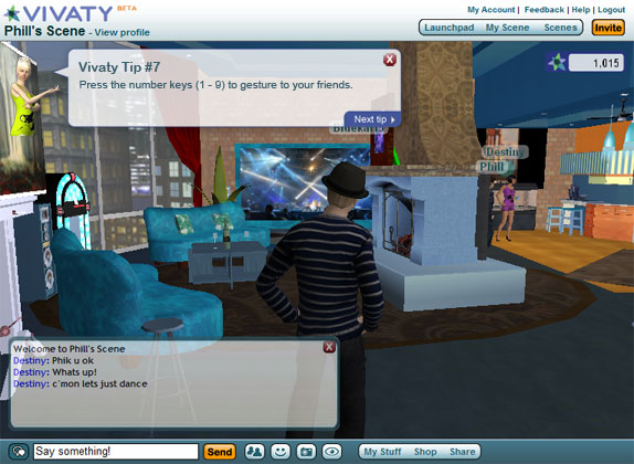
Early on in the development of Vivaty, it was decided that some sort of user tips needed to be included with the experience to hint at features that may not be immediately apparent. In a sense, the initial design was nothing more than a band aid for disparate features while we reorganized and redesigned the experience. Very quickly the tips began to annoy and distract users because of their position and constant display on load. Users became adept at closing this window immediately.
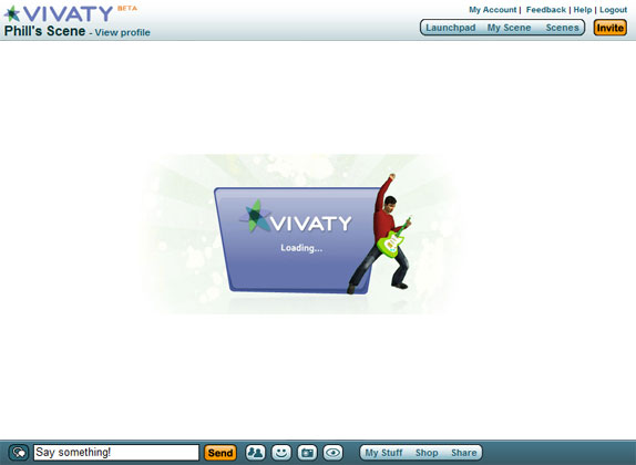
The load experience that was used from the beginning of Vivaty was essentially a graphic layer of X3D that obscured the loading 3d content until the scene object was loaded. After 8 months of staring at the same guitar player graphic, the proverbial light bulb went on. We needed to combine the user tips with our load screen, allowing us to educate users and reclaim this time.
Like many of the Vivaty interfaces, the layout must be able to scale to a very inclusive set of dimensions. The elements of the interface must scale from small embeds as small as 550 x 300 all the way up to super high resolution monitors. The loader needed to scale appropriately but also appear uniform and be quick loading.
The Solution
The user story that drove this project was simple and straightforward. Just imagine the user, especially a recent convert, continually loading pages and seeing the same dull graphic. The graphic itself uses an avatar using an object that we hadn't released. Even the image implied something that was not all that useful to anyone. Now imagine the same user reloading the scene and getting a colorful load message that includes a useful piece of information and tips for using the product.
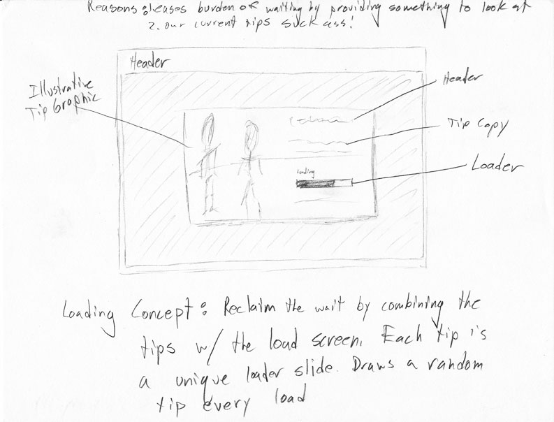
I started this process by wireframing a concept for how the tips would be displayed. Since the frame of the application holds location details, we didn't need the loader to tell the user what was loading. This meant we could include only tips and a simple loader which gave me more room to make the tip messages more visual.
The actual tip graphic sits centered atop background images that are feathered to a white. As the x3d object is sized, the image stays centered and fades to white, allowing the layout to feel native in any size. The actual layout still exists in x3d and only loads two random graphics at a time. Being so simple allows it to be extremely lightweight both in graphics and scripts.
Next - Vivaty Launchpad >><< VCF Iconography - PreviousWeb


Branding & Icons


UX Case Studies


